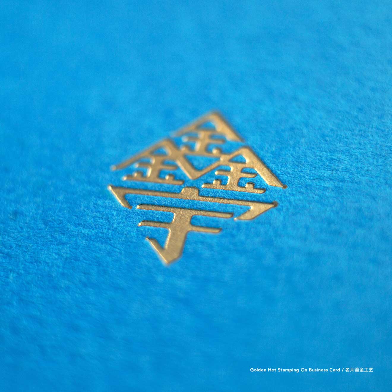
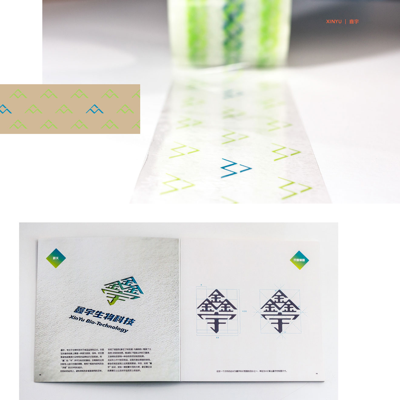
| The design of the logo is based on the two Chinese characters o f the company name, with some modification to the strokes to integrate them an d to make it look symmetrical. A blue color that represents technology and a gree n color that symbolizes nature are use with gradient to give the logo a dyna mic visual impact. | 以“鑫”和“宇”字作为标志的基础,在笔画的比例对称性上进行调整,使两字结合。色彩上采用了象征科技感的湖蓝色与寓意大自然的嫩绿色渐变,赋予标志灵动的视觉效果。 |


